
- 6.1. Interactive scatter plot
- 6.1.1. Legend
- 6.1.2. Changing features
- 6.1.3. Sample inspector
- 6.1.4. Switching between different sets of labels
- 6.1.5. Visualizing subsets of samples
- 6.1.6. Visualizing confusion matrix with visible and hidden samples
- 6.1.7. Bringing class to top, z-order of classes
- 6.1.8. Creating new label set
- 6.1.9. Hand-painting class labels
- 6.1.10. Tagging individual samples
- 6.1.11. Label visible samples as...
- 6.1.12. Renaming classes
- 6.1.13. Visualizing live feature distributions in scatter plot
- 6.2. Interactive plot of per-class feature distributions
6.1. Interactive scatter plot ↩
perClass provides an interactive scatter plot sdscatter. We can launch
it on any data set - here we create a data set with three features computed
from road sign images. We will compute mean, standard deviation and median
of each data set row (image reshaped to a vector):
>> a
381 by 1024 sddata, 17 classes: [31  28  24  33  19  21  57  26  21   9  13  15  14   1  14  29  26]

>> a2=setdata(a,[mean(+a,2) std(+a,0,2) median(+a,2)])
381 by 3 sddata, 17 classes: [31  28  24  33  19  21  57  26  21   9  13  15  14   1  14  29  26]
By default, the feature labels are:
>> a2.featlab
sdlab with 3 entries: 'Feature 1','Feature 2','Feature 3'
We may set the feature labels to descriptive names using:
>> a2.featlab=sdlab('mean','std','median')
381 by 3 sddata, 17 classes: [31  28  24  33  19  21  57  26  21   9  13  15  14   1  14  29  26]
>> a2.featlab
sdlab with 3 entries: 'mean','std','median'
In order to visualize the scatter plot, we invoke the sdscatter command:
>> sdscatter(a2)
ans =
 1
sdscatter opens a new figure and returns its handle:
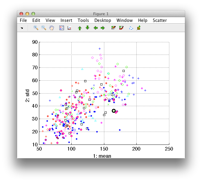
The figure shows scatter plot of the first two features in the data set. Each point represents one data sample (here a road sign). The color and marker styles correspond to different classes.
By moving the mouse over the plot, we're shifting focus to the closest data sample represented by black marker. The figure title provides details about the highlighted sample, such as its index in the data set and class.
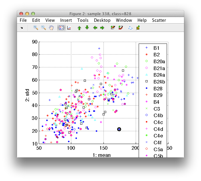
6.1.1. Legend ↩
The legend may be switched on either by a toolbar button or by pressing the
l key (as in legend):
6.1.2. Changing features ↩
We can change features shown in sdscatter using arrow buttons on the
toolbar or with corresponding cursor keys. "Left" and "Right" arrow flips
through the features on the horizontal and "Up" and "Down" through the
features on the vertical axis.
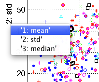
In order to directly select a feature of interest, use right click on the axis legend. A pop-up menu will appear listing the features available.
If more than 25 features are present in the data set, a dialog will appear allowing us to select a feature by its index.
6.1.3. Sample inspector ↩
Sample inspector shows a detailed view of a current sample. We can select
the Show sample inspector command from Scatter menu. The dialog opens
asking for the name of the data set which contains data of intereset. We
will type a and click on OK. A separate window opens showing detailed
view of the currently highlighted example.
If our data set contains images, sample inspector may show the per-sample
image instead of feature plot. To show image data, the sample inspector
needs information on image size. We can add this to our data set a as
'imsize' data property, indicating that it contains image information
rescaled into [32 32] raster:
>> a=setprop(a,'imsize',[32 32],'data')
381 by 1024 sddata, 17 classes: [31  28  24  33  19  21  57  26  21   9  13  15  14   1  14  29  26]
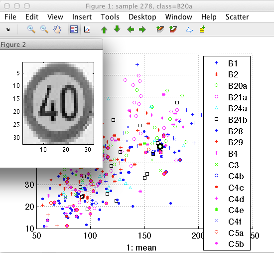
You can use the sample inspector to identify outliers or to understand which objects fall in the area of overlap.
6.1.4. Switching between different sets of labels ↩
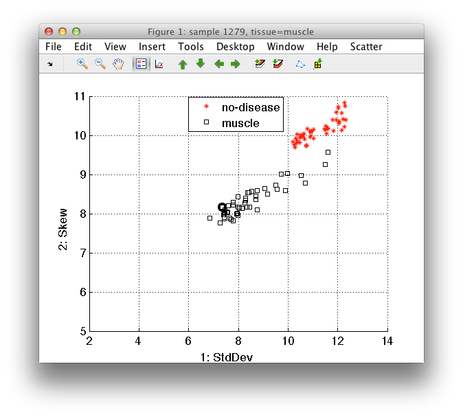
It is often beneficial to use multiple sets of labels. For example, in a medical problem, we may be interested not only in the top-level class such as 'disease'/'no-disease' but also in specific type of tissue or in the patient the sample originates from.
sdscatter may visualize any sample labeling available in the data
set. Any sdlab object stored as a sample property is available.
Let's use a medical data set from cancer detection problem in this example. It contains information on pixels in scans of multiple patients. For each pixel, we know the high-level label such as 'disease'/'no-disease' more precise tissue type and patient:
>> load medical;
>> a'
'medical all' 225119 by 11 sddata, 2 classes: 'disease'(56652) 'no-disease'(168467)
sample props: 'lab'->'class' 'class'(L) 'pixel'(N) 'patient'(L) 'tissue'(L)
feature props: 'featlab'->'featname' 'featname'(L)
data props:  'data'(N)

>> sdscatter(a)
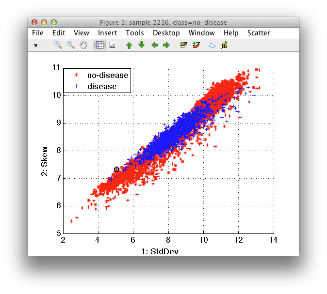
We may switch between different labels via Use label command in Scatter menu.
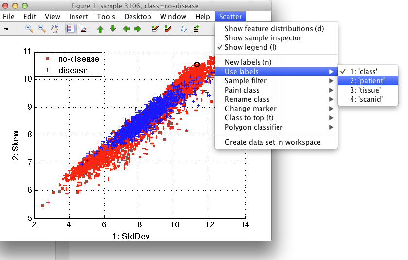
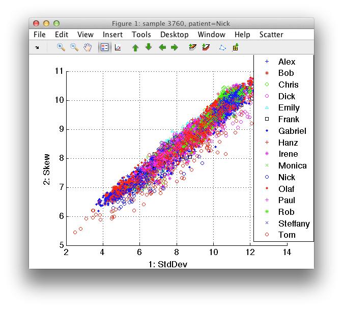
Switching to patient labeling:
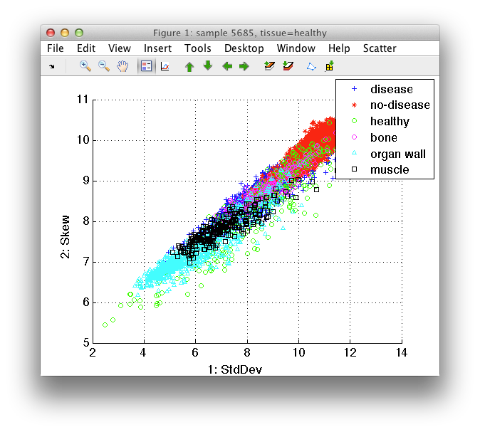
We may switch quickly to a specific set of labels using the 1-9 shortcut keys. In our example, the tissue labels are accessible by pressing '3':
6.1.5. Visualizing subsets of samples ↩
sdscatter allows us to show only subset of samples defined by label
values. This feature is accessible via the Sample filter command in
Scatter menu.
For example, we may be interested only in no-disease tissues. We can select only no-disease examples in *Scatter/Sample filter/class*.
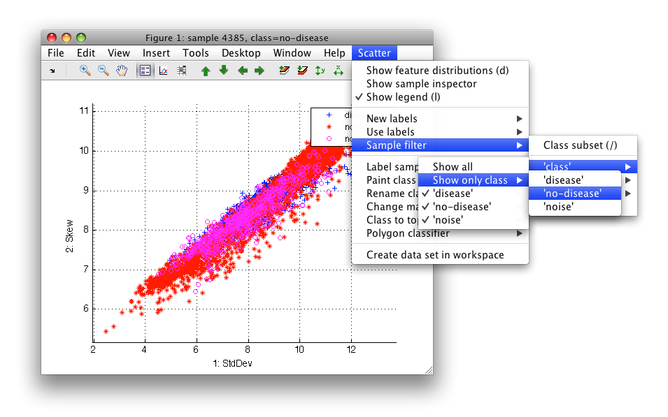
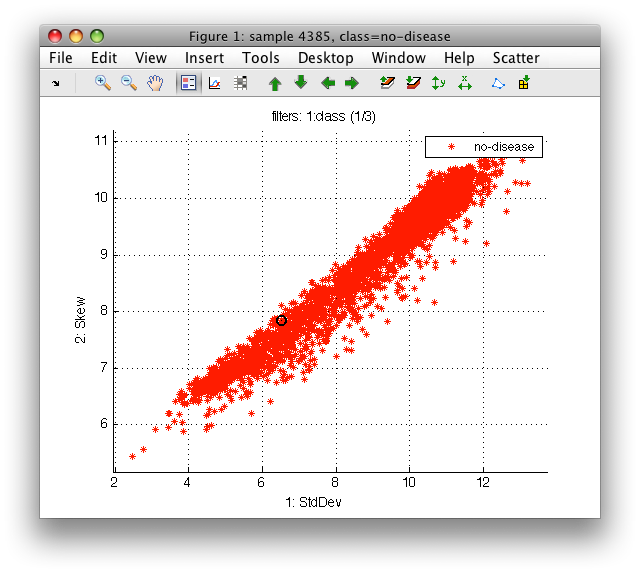
Note the filter string above the figure - it shows that 1 or 3 classes is shown in the current label set.
Any filter may be inverted using 'Invert filter on...' menu command or 'i' keystroke.
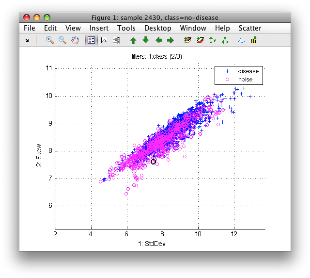
Now, the scatter plot shows two or the three classes.
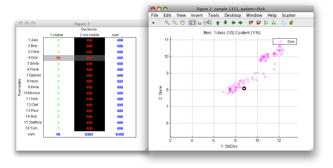
We may combine multiple filters. For example, we might be interested only in no-disease of patient 'Dick'. Switch to patient labels (Scatter/Use Labels).
We may choose specific class in several ways.
- Sometimes, we can just directly point with a mouse to a sample of desired class, use right-click context menu with 'Show only this class' (or 'o' keystroke).
- Alternatively, we may use Scatter menu with Sample filter/Class subset command and enter class name (or any substring or regular expression). This command is available under '/' key stroke
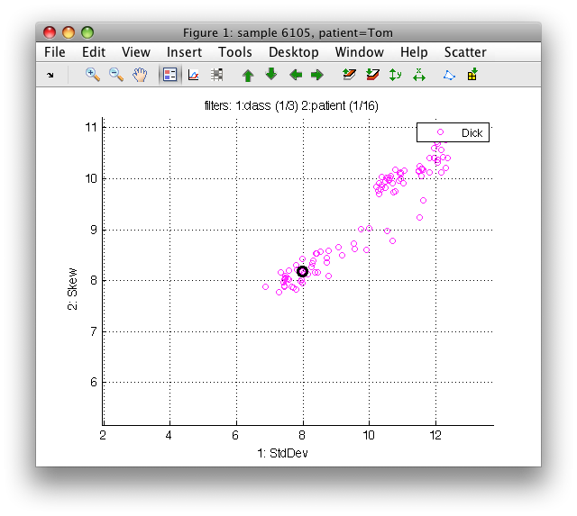
We can see information about all filters above the plot: In 'class' label set, one class of three is selected, in 'patient' one of 15. Filter inversion affects only the currently selected label set. For example, by pressing 'i' while being viewing patient labels, we would show all patient but 'Dick' and only the 'no-disease' class for them.
The sdscatter preserves axes limits of the total data set also for the
sample subsets. This gives us important clues about position of the subset
within the total data distribution. If we are interested in the detailed
view of the subset, we may enter the automatic mode by pressing 'a'
key. The limits will then be set according to the subset. Pressing 'a'
again returns us to the full data set limits.
When visualizing sample subsets, we may freely move between different sets of labels. For example, by pressing '3' we use 'tissue' labels which shows us the specific no-disease tissues of Dick:
To quickly return to the previous filter, use 'f' key or *Sample filter/Apply previous filter* command. This allows us to understand the differences between distributions.
Visible subset of samples may be stored in a new data set in Matlab workspace using Create data set with visible samples menu command.
6.1.6. Visualizing confusion matrix with visible and hidden samples ↩
When using filters to view a subset of data, it may be useful to understand what categories and how many samples are shown.
To open the confusion matrix view, use the toolbar button or 'c' key:
6.1.7. Bringing class to top, z-order of classes ↩
Overlapping classes may easily obscure scatter plots of large
data sets. sdscatter provides Class to top command in the Scatter menu
which allows us to bring desired class on top. In this way, we can better
understand what happens in the area of overlap.
We will demonstrate this function on the artificially-generated three-class data set:
>> load fruit_huge
'Fruit set' 20000 by 2 sddata, 3 classes: 'apple'(6667) 'banana'(6667) 'stone'(6666)
>> sdscatter(a)
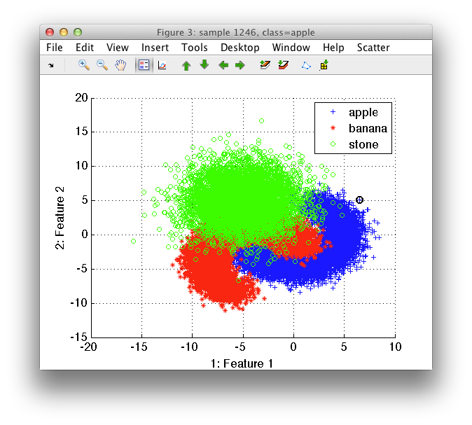
The stone class obscures the banana distribution. By selecting Class to top and banana, we change the order in which the classes are plotted, so that banana appears on top.
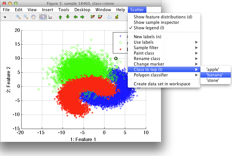
sdscatter also offers two keystrokes for easy flipping through the
plotting order (z-order) of classes using + and - keys (to make things
simpler, the = works as + so three is no need to hold SHIFT).
6.1.8. Creating new label set ↩
New label set may be created using Scatter/New labels sub-menu. There are two commands available:
- 'Empty label set' with all samples in 'unknown' class ('n' keystroke)
- 'From current label set' copying the current label set into a new one ('N' keystroke)
The later option allows us to create new labels that will be changed (e.g. by sample painting, tagging or relabeling)
6.1.9. Hand-painting class labels ↩
sdscatter allows us to define class labels directly by painting. In this
way, we can interactively label interesting groups of samples such as
outliers, areas of overlap or class modes.
Painting is accessible both from the Scatter menu, from context-sensitive menu or via 'p' keystroke.
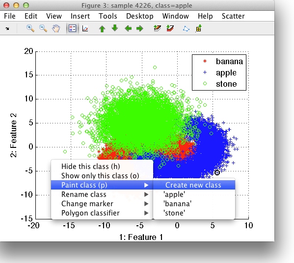
We need to specify which class to paint. It can be either one of the existing classes or we can create a new class. In our example, we are interested in the area of overlap and will, therefore, create a new class called overlap.
In painting mode, the square is added to the scatter plot axis. By holding left mouse button, we assign the samples included in the square into the desired class.
Note that while painting, you can freely switch between features to find the best views for your problem. You can also hide some of the classes using Class visibility command. Painting assigns the labels only to visible data samples.
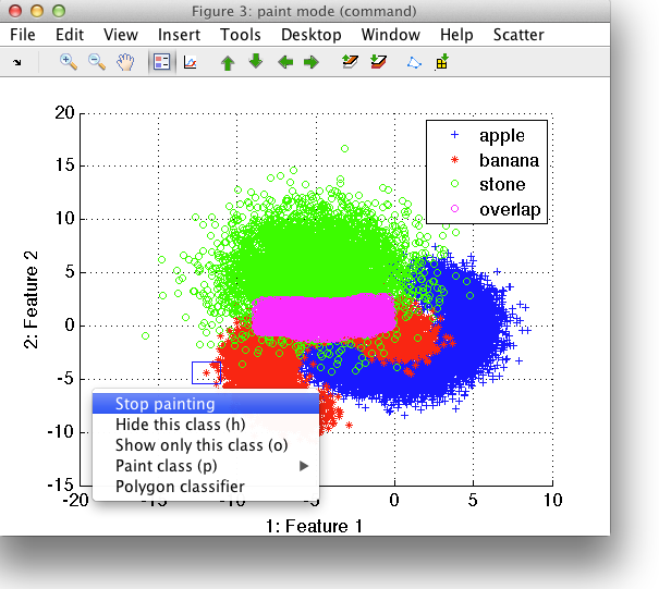
When finished, choose Stop painting from the context menu or from the Scatter menu.
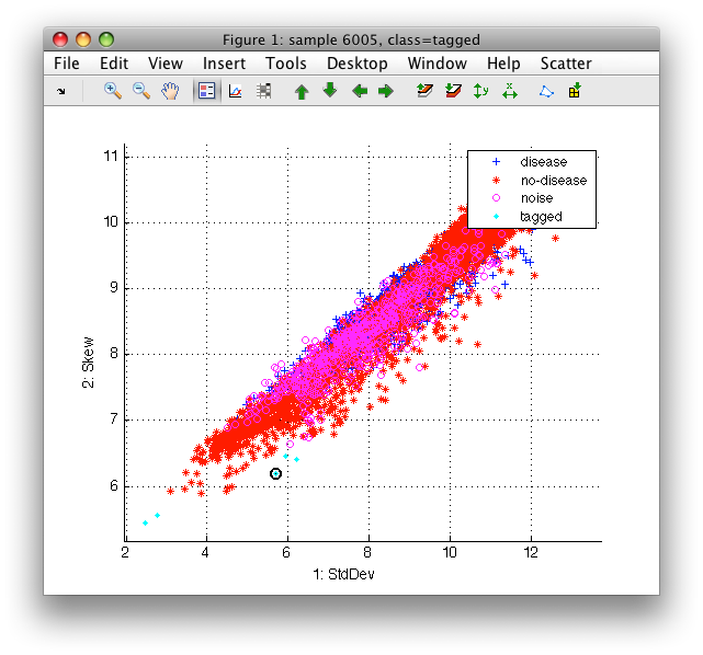
6.1.10. Tagging individual samples ↩
Sometimes it is convenient to tag individual samples instead of painting. This may be done by double-clicking on a sample or using 't' keystroke. The selected samples are labeled as 'tagged'.
Tagging select all samples with identical 2D coordinates. Therefore, we may easily label all copies of an outlier sample superimposed on top of each other.
There is no way to undo the tagging. You may therefore first create a new label set from current labels and perform tagging on this set.
6.1.11. Label visible samples as... ↩
Visible samples may be assigned a single (possibly new) class name using 'Label samples as...' command in the right-click context menu or 'L' keystroke.
Typical use-case is:
- create a new label set from current labels ('N' key-stroke)
- apply filters to see desired subset
- label this subset into a new category ('L' key-stroke)
6.1.12. Renaming classes ↩
sdscatter provides a simple way to rename classes. This facility is
helpful to re-arrange the data set or to assign meaning to labels generated
by cluster analysis.
The function is accessible through Rename class command in the context menu or in the Scatter menu.
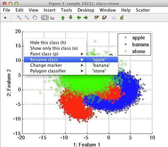
We can, for example, rename the apple and banana classes into fruit. Using the Create data set in workspace command from Scatter menu, we can save this data set into the Matlab work-space. The resulting data set will have only two classes, namely stone and fruit.
>> b  %  Created sddata b with all label sets.
Fruit set, 10000 by 2 sddata, 2 classes: 'stone'(3334) 'fruit'(6666)
>> b.lab.list
sdlist (2 entries)
 ind name
   1 stone
   2 fruit
Note that interactive renaming of classes makes sense when used with
interactively defined classes. For existing classes in the data set, it is
simpler to use the sdrelab function as we discussed here.
6.1.13. Visualizing live feature distributions in scatter plot ↩
When visualizing large data sets, the scatter plot alone is often not
sufficient to judge the class overlap. To visualize the overlap conditions,
sdscatter offers to include feature distribution plot for each of the
axes.
Select Show feature distributions in the Scatter menu or press 'd'. Scatter figure will be extended with an additional distribution plot for horizontal and vertical axis:
>> a
'medical D/ND' 6400 by 11 sddata, 3 classes: 'disease'(1495) 'no-disease'(4267) 'noise'(638)

>> sdscatter(a)
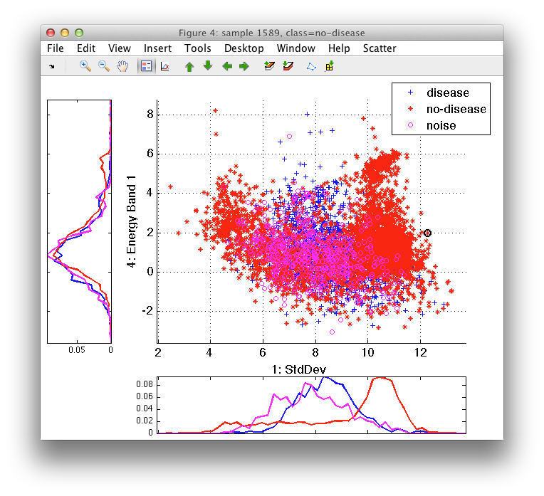
The distribution sub-plots show histograms for each of the available classes. Because the axes limits are aligned, we may better understand where the true area of high class density is located. When you focus on a subset of classes, switch between sets of labels or paint labels, the plots are updated accordingly.
To remove the class histograms, select Hide feature distributions from the Scatter menu or press 'd' key again.
6.2. Interactive plot of per-class feature distributions ↩
The visualization of the per class distribution of each feature gives an
indication of the class overlap. The sdfeatplot provides this plot. In
order to visualize the distribution for different features use the up/down
cursor keys or click the green arrows icons in the menu.
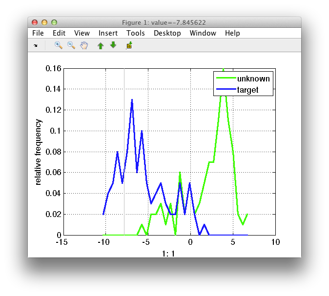
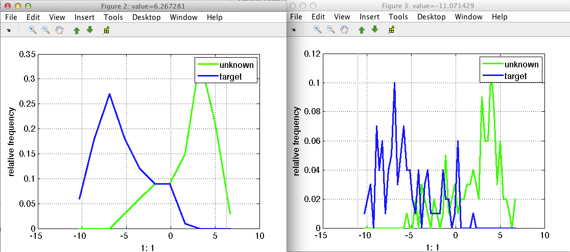
The image shows the distribution for the two classes present in the data. By default the labels are used, but the 'lab' option allows to visualize the distribution of other properties present in the data set. The distribution is obtained computing the histogram. The default number of bins is 30, but it can be customized using the 'bin' option. In the figure below is the same distribution using 10 or 50 bins. Of course the larger the number of bins, the more "noisy" the distribution may look.
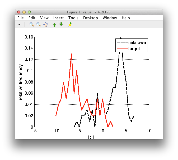
The style of the distribution may be customized using the 'style' option.
>> sdfeatplot(out2,'style',{'k--','r-'})
sdfeatplot provides several options to enhance the visualization if the
features of interest are obtained from the computation of histograms. For
example, pressing the 's' keystroke switches to the stem-plot, highlighting
individual histogram bins. The bins for the grid maybe computed
automatically, with linearly spread bins over the data
range. Alternatively, the unique values may be visualized using the 'u'
keystroke. This is especially useful in case the feature histogram is very
sparse. In this case, the direct inspection of the bins values gives a
better understanding (right plot in the figure below) compared to the
distribution plot (plot on the left).
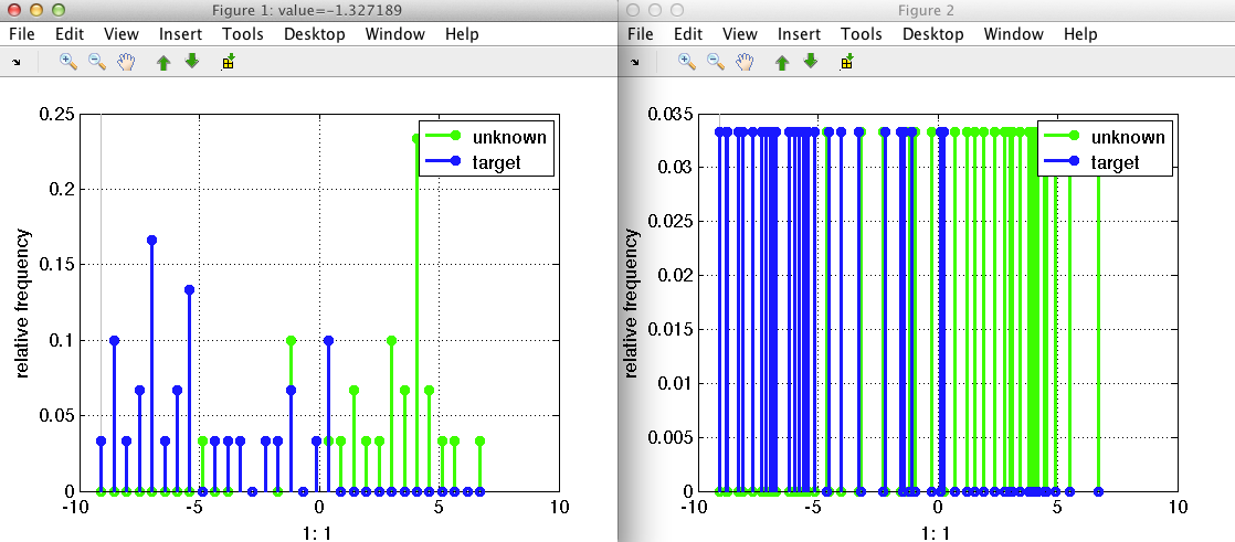
Using the 'x' keystroke the x-axis for the bins maybe specified. This is especially useful if the data has logarithmic scale.